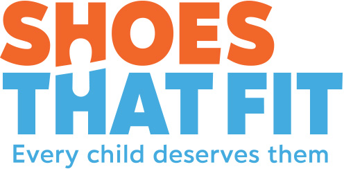
We are very proud to introduce our new logo!
While we loved our old logo with the little girl (Stephanie), it wasn’t ideal for sharing in all mediums. It did not always show up well against different backgrounds. And after 18 years, our old logo was not reflecting who we are at Shoes That Fit, now, in 2021.
In short, “Stephanie” is graduating, and we wish her all the best!
Our new logo focuses on our name and a shoeprint that sums up giving shoes and stepping forward with hope.
We also have new colors:
Orange – calls to mind feelings of excitement, enthusiasm, and warmth. Also brings to mind activity and sports.
Light Blue – blue brings feelings of calm, and this bright blue reminds us of a clear sky, and the sky-high potential of the kids we serve
We think the colors reflect our mission and cause as youthful and optimistic. We are all about the kids and serving them and we are hopeful that together we can make a better future.
In short…
What’s changing: the logo, our colors
What’s staying the same: our name and our mission: to give kids in need Shoes That Fit
Special thanks to Suzy Lebovitz-Edelman for funding the new logo design for us!


